- Get link
- X
- Other Apps
A couple of days ago, I wrote about a bunch of Stadium Club cards that I acquired in a group break held by Colbey over at Cardboard Collections. As I mentioned during the first post, there was more to the package than just assorted Stadium Club Reds.
First of all, there was the whole reason I signed up for the group break - Stadium Club Barry Larkin cards!
In all, I ended up with 15 Barry Larkin cards from the various editions of Stadium Club. However, of the 15, only 8 were unique cards. I figure that eight cards is probably enough to do a little countdown - so let's get to it!
The Top 8 Barry Larkin Stadium Club Cards from Cardboard Collection's Group Break:
#8: 1995 #498.

I like when card companies try to do something unique. However, I don't think I like when they decide that it would be a good idea to put together a card front with text that looks like it's ripped out of a ransom note. The rainbow effect doesn't help matters either.
#7: 1995 #407

The 1995 Stadium Club set hasn't fared well so far. In general, I like the idea of Cover Story (something that both Topps and Upper Deck have used as a subset in various sets). What I don't like is the fact that the photo is so obviously canned it's painful. The one redeeming quality of the card is that Larkin's wristbands (with his own image on them) are fairly obvious in the photo.
#6: 1995 #211

Once again, we find another 1995 Stadium Club card at the bottom of the list. Admittedly, while I didn't particularly love either of the previous two cards, on a different day this particular card might rank a bit higher.
#5: 1996 #271

The Stadium Club designs of the mid-90s were a mixture of flashy and classy. Some designs, such as the 1996 tended toward the classy side while others (mostly the subsets) tended toward the flashy end of things. I happen to like the '96 base card of Larkin quite a bit, my main quibble though is that the nameplate blocks out the bottom portion of the photo - it looks like sloppy design to me.
#4: 1996 #197
Remember what I said about class vs. flashy? Here's one of the flashy subsets. Admittedly, I don't care for the design much but the photo more than makes up for the weak design elements (vertical text - no thanks).
#3: 1993 #415

As with most things in life, my interests vary depending on when you talk to me. Sure, I've always loved the Reds (and my wife), but otherwise things come and go. There have been points in my life where I've collected coins for instance - but I don't do that now. At other times I collected Legos (something that I'm actually getting back into now). I've spent a good chunk of time on origami as well. Two summers ago, I was enamored with woodworking. How does all of that relate to the above Larkin card? Well, in 2009 I wasn't a huge fan of the card. Three years later, the card ranks #3 on my countdown. What can I say? Interests and tastes change over time.
#2: 1994 #414

Out of all of the Stadium Club sets in the group break, if I were ever to try to complete my own set it would probably be the 1994 set. For some reason, I like the look of the set - maybe it's the childhood memories that the set sparks in my mind? I have no idea, but for whatever reason, I like the cards - and thus, this particular card earns the #2 spot in the ranking.
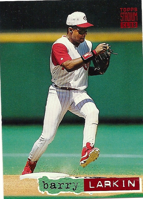
#1: 1995 #35

Remember all the ugly 1995 Larkin cards from earlier in the countdown? If anything, this card serves as proof that base Stadium Club cards are about as nice as they come. This card is a great photo, with a pretty solid design. The horizontal orientation of the card complements the photo as well - a design element that I appreciate.
All in all, the Larkin haul was impressive - and for that, the group break in itself was worth every penny. Despite that, there's even more in the box from Colbey, but the next round of goodies will have to wait for another day!
First of all, there was the whole reason I signed up for the group break - Stadium Club Barry Larkin cards!
In all, I ended up with 15 Barry Larkin cards from the various editions of Stadium Club. However, of the 15, only 8 were unique cards. I figure that eight cards is probably enough to do a little countdown - so let's get to it!
The Top 8 Barry Larkin Stadium Club Cards from Cardboard Collection's Group Break:
#8: 1995 #498.

I like when card companies try to do something unique. However, I don't think I like when they decide that it would be a good idea to put together a card front with text that looks like it's ripped out of a ransom note. The rainbow effect doesn't help matters either.
#7: 1995 #407

The 1995 Stadium Club set hasn't fared well so far. In general, I like the idea of Cover Story (something that both Topps and Upper Deck have used as a subset in various sets). What I don't like is the fact that the photo is so obviously canned it's painful. The one redeeming quality of the card is that Larkin's wristbands (with his own image on them) are fairly obvious in the photo.
#6: 1995 #211

Once again, we find another 1995 Stadium Club card at the bottom of the list. Admittedly, while I didn't particularly love either of the previous two cards, on a different day this particular card might rank a bit higher.
#5: 1996 #271

The Stadium Club designs of the mid-90s were a mixture of flashy and classy. Some designs, such as the 1996 tended toward the classy side while others (mostly the subsets) tended toward the flashy end of things. I happen to like the '96 base card of Larkin quite a bit, my main quibble though is that the nameplate blocks out the bottom portion of the photo - it looks like sloppy design to me.
#4: 1996 #197
 |
Remember what I said about class vs. flashy? Here's one of the flashy subsets. Admittedly, I don't care for the design much but the photo more than makes up for the weak design elements (vertical text - no thanks).
#3: 1993 #415

As with most things in life, my interests vary depending on when you talk to me. Sure, I've always loved the Reds (and my wife), but otherwise things come and go. There have been points in my life where I've collected coins for instance - but I don't do that now. At other times I collected Legos (something that I'm actually getting back into now). I've spent a good chunk of time on origami as well. Two summers ago, I was enamored with woodworking. How does all of that relate to the above Larkin card? Well, in 2009 I wasn't a huge fan of the card. Three years later, the card ranks #3 on my countdown. What can I say? Interests and tastes change over time.
#2: 1994 #414
Out of all of the Stadium Club sets in the group break, if I were ever to try to complete my own set it would probably be the 1994 set. For some reason, I like the look of the set - maybe it's the childhood memories that the set sparks in my mind? I have no idea, but for whatever reason, I like the cards - and thus, this particular card earns the #2 spot in the ranking.
#1: 1995 #35

Remember all the ugly 1995 Larkin cards from earlier in the countdown? If anything, this card serves as proof that base Stadium Club cards are about as nice as they come. This card is a great photo, with a pretty solid design. The horizontal orientation of the card complements the photo as well - a design element that I appreciate.
All in all, the Larkin haul was impressive - and for that, the group break in itself was worth every penny. Despite that, there's even more in the box from Colbey, but the next round of goodies will have to wait for another day!
Take image from card #4 - put the design of card #1.
ReplyDeleteProfit.