
According to baseballcardpedia, the 1998 Opening Day product was produced by Topps as a direct response to MLB asking the company to produce an affordable set for children. The result was Topps taking it's '98 flagship set, recoloring the borders to silver (rather than gold) and slapping an Opening Day silver foil logo on the front of each card. The Opening Day set is a partial parallel of the '98 Topps flagship set as it is only 165 total cards in set size (as compared to 503 cards in flagship Topps from 1998).
The 1998 Opening Day set is as "pure" of a baseball card set as you'll find. There's nothing but base cards - no inserts, no parallels, no hits of any type. The set lives and breathes on its design and player selection only...so how did our box pan out?!
For starters, I think the '98 Opening Day design with the silver borders is vastly superior to the 1998 Topps flagship design with the brownish gold borders. I find the Opening Day cards much easier to read thanks to the silver foil offering better contrast than the gold foil on flagship Topps.
Our box ended up yielding 157 of the 165 possible base cards along with 10 duplicates. Our eight missing base cards were #s: 19, 62, 100, 115, 118, 119, 122, and 148. With ten duplicates included, I would have preferred that eight of those ten duplicates were replaced by the eight regular base cards missing from our box - that seemed like a bit of a collation error by Topps.
The other error that Topps seemed to have done is how they filled the packs. Many of the packs had a single card with a dinged corner (so it wasn't a case of the packs themselves being damaged but rather how the cards were inserted into the packs). The dinged corner didn't show up in every pack (luckily) but it did happen enough that I became kind of annoyed by it.
With the bad out of the way, let's get to the good stuff - and the good stuff is the set itself. The box was chock full of great photos (the comment was made during the live group break about how awesome 1998 Stadium Club must be if they had enough great photos left over to make this set)! Don't take my word for it though - here's a quick sampling of some of my favorite photos from the set:
First, some lovely horizontal cards:

The (obviously posed) Guerrero shot and the perfectly framed Steinbach photo are my two favorites from this bunch. You can see how nice the cards look framed by the silver borders (and while the Opening Day "stamp" is probably too big, I kind of love it despite its gaudiness)! This would be a good time to check out the card backs as well - and like the card fronts, the backs are a solid design:

My main beef here is the card number - kind of difficult to read but even worse, the orientation is super annoying when sorting through a large stack of cards (like when you need to sort through an entire box's worth of cards to write a box review post, for example)! The rest of the card back is nearly perfect though - great secondary photo, lovely full career statistics, and even team logo "wallpaper" which will make sorting the cards into team stacks a piece of cake for this group break!
Back to the card fronts, there were also a number of great vertically-oriented cards:
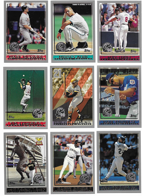
That Griffey is a thing of beauty, love the Guillen with the statues (and rookie cup!), and the Clemente honorary card is also very nice.
Finally, there were even a bunch of cards featuring "props" that I found interesting:
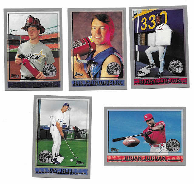
I love that Topps went all-in on the fireman idea for relievers!
Overall, I give the 1998 Topps Opening Day box the following rating:
Set Design: A+
Collation: C
Opening Thrill: B
Overall: B+
This is a set that lives and dies by the base design and base photography since there's literally nothing else in the set to chase down (no parallels, inserts, etc.). For me, the simplicity works well - and luckily for Topps, the 1998 flagship design worked out even better in silver frames! I would have liked the box to yield a full base set rather than the duplicates (and dinged corners) but other than that it was a fun box to open as each pack seemed to have at least one card that made me pause and say "oh wow, cool!" You can't ask for much more than that...and as I see it, this set is proof that Topps could make a "kid friendly" set that collectors will also appreciate!
Very cool set with some nice photography. It took me a second the even find the card number on the back. Since I work in the fire safety industry, I rather liked the fireman concept.
ReplyDelete👍
ReplyDeleteI love my 90's inserts, parallels, and hits... but I've gotta admit going back in time to see a product with no inserts, parallels, or hits is truly refreshing.
ReplyDeleteThat's really annoying that a bunch of the cards had corner dings. And even though you had a couple handfuls of duplicates, it's pretty impressive that you were that close to having a full set from one box. The photography is a bit quirky, but I like it! Looks like a fun box of cards overall!
ReplyDeleteThis set is new to me, but I like it. The damaged cards suck, but that's one of the hazards of opening older items, you don't have any recourse for wonked up cards.
ReplyDelete