As I mentioned a few weeks ago, I recently received a box of 2010 Topps National Chicle (retail version) from CSN stores as part of my sponsorship with CSN. As I opened the box, I couldn't help buy wonder:
Why Didn't Topps National Chicle Get More Love?
As a whole, the blogosphere seems to constantly pine for new ideas, new sets, and new concepts. Last year, Topps did exactly that with the release of an all-painted set. It was like the hugely popular UD Masterpieces from a few years ago (at least in concept) and yet, for intensive purposes, Chicle was a gigantic failure. You don't see 2011 National Chicle sell sheets online do you? Didn't think so. (Unless you check here of course - they are trying to sell 2010 boxes as if they were 2011 boxes.)
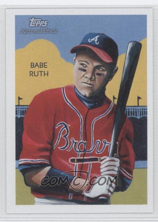 I know that Topps got off on the wrong foot by showcasing that Babe Ruth / Chipper Jones card (image from checkoutmycards). Almost everyone seemed to think it was the worst possible card ever (which is no small feat since we have cards of revolving doors, microwaves, and failed presidential nominees).
In fact, the card does appear to feature Chipper Jones despite the name Babe Ruth on the left - though I seem to recall someone doing the proper research to determine what the photo looked like that inspired the card - maybe someone can enlighten me in the comments.
No matter, I agree with the masses that this card is a terrible example. However, most of the set isn't weird cards like the Ruth (in fact, that particular Ruth card was a short print so most people wouldn't see it anyhow).
Late last spring (and then again in the summer), I opened a couple of blasters and some loose packs of National Chicle. To quote myself, my feelings of the set were summed up by the following:
... I'm not sure the set really is all that exciting. I can't even decide if I want to try and complete the base (non-short prints) set or not... I guess when I'm that indecisive, I might as well not bother.Obviously, I wasn't enamored with the cards either at the time. However, time changes ideas (and perhaps coupled with a lack of variety amongst baseball card sets lately), I decided to take another look at Chicle with a full retail box.
I won't spoil all the contents of the box today - I'm only going to show the first pack. However, the question remains: Why Didn't Topps National Chicle Get More Love? And, as a follow-up question, do you like the set more now than you did last year when it came out (like I do)?
Anyhow, let's take a look at the first pack (the box contains 24 packs):
Pack 01:
 22. Tim Wakefield
Ok, a terrible start to a set that I think deserves a second chance. This card might be worse than the Ruth/Chipper monstrosity mentioned above. Wakefield looks like he just got punched in the eye and, as a result, is so delirious that he somehow believes the baseball is actually a red delicious apple. I'm also a bit disturbed by the man fur patch running up Wakefield's arm in the sketch.
 47. Brandon Inge
From a terrible card to a truly great card, a pack of Chicle is sure to hit upon most of the psychological scale (as any art should, correct?). For me, this particular card is what the 2009 Goudey set should have looked like: less creepy and more vibrant. The best part of the Inge card is actually the background. It appears there is a simple school house in the background along with nondescript trees. It's like Inge is playing in your backyard or local park - and with that comes a wave of nostalgia. Kudos to the artist, Jason Davies.
 100. Adam Dunn
Much like the Inge card above, the Dunn card is another card that hearkens back to the "innocent" days of the game - in this case, it appears Dunn is about to hit a home run (or maybe more accurately, strike out) in a single A ballpark somewhere in middle America. This card was illustrated by Ken Branch, and I know that because Topps included a brief bio of the artist on the back of every card. Definitely a nice touch by Topps (and I'm sure a selling point for the artists for lots of advertising for their websites)!
 134. Felix Pie
I'm not particularly fond of this painting, but what I like about this card is the description on the back:
The Orioles often insert Pie late in the game because he's such an outstanding defensive outfielder. Being good in the garden starts before the pitch. The "ready" position is to have your feet shoulder-length apart, knees bent slightly and weight on the balls of your feet so you can push off in any direction.Since when has the field been referred to as the "garden"? That's some awesome terminology that I've never heard in that context before.
 137. Zack Greinke
There are also some horizontal cards in the set - this particular card looks like it could be a copy of almost any base Topps card from the last three years. That's not necessarily a bad thing, but it's certainly not an overly creative card. The red background is reminiscent of Cracker Jack cards from 2004 for me.
 179. Carlos Quentin
The last card (numerically) in the pack is a nice illustration of Quentin done by Jason Davies. In this particular pack, I think the Quentin is a perfect "mean" or "average" card. It's neither appalling nor exciting - kind of like most art I guess.
Obviously, this pack didn't contain any retail mojo...or even a short print or variation back. It is, however, a great cross-section of the set. The artistic direction differs from card to card thanks to a variety of artists and styles. That, coupled with some of the short print shenanigans, has created a set that seemed to initially repulse many collectors, but has your view changed over time? I look forward to your comments!
In other news, I'll be busting the rest of the box over the next few days - and yes, I think I'll chase the full base set. I doubt I'll go for the short prints but I'm going to wait to see how close I end up before making any drastic decisions (plus it would help if there were people with piles of the set they are waiting to unload on someone)!
I loved this set. Some of the paintings are a little goofy. The on-card autos are sweet. I wish this set was coming back for one more try.
ReplyDeleteI just saw these cards for the first time a couple of months ago (as I just got back into collecting), but I instantly loved them.
ReplyDelete(Although I'm likely to love just about any painted set).
I didnt have a problem with them. I pulled a Madison Bumgarner auto from a Target Blaster last year
ReplyDeleteI actually liked the set a lot. I don't understand all the hate for it. But I guess that will happen with an art set.
ReplyDeleteIf the boxes stayed in stores longer, I probably would've been convinced to collect the whole set.
I bought a blaster last summer and was pleasantly surprised by how many of the cards I liked. I also got a bonus bunch of them unexpectedly in a box lot.
ReplyDeleteThe Inge is great. I just bought one from COMC. Good post buddy.
ReplyDeleteI've been trying to collect the set for a while now only missing a couple base cards....LMK if up for a trade.
ReplyDeleteI've got some doubles for you, and as anathema as this may sound Chicle was my favorite set from last year. Keep me in mind if you pull any Met stuff.
ReplyDeleteI have a bunch of doubles. I will keep an eye on your needs.
ReplyDeleteI also am chasing the set, although so slowly I have not actually figured out which cards I need. I figure I am about 1/2 way there.
I just think it's extremely unappealing to the eyes. I haven't found anything to like about it.
ReplyDeleteI loved the concept of Chicle and just didn't like the execution. My main gripe was that of the limited cards I cared about (Tigers) I found the paintings very disappointing.
ReplyDeleteThe Inge is one of the better Tigers in the set, and that is saying something because I think he looks like the Human Fly because of the shadows and glasses.
Personally, I would have loved to see the set get another go in 2011 because I think it was this close to being great and just needed some kinks worked out.